Assignment:
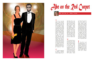
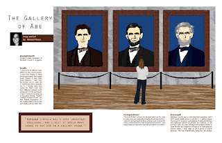
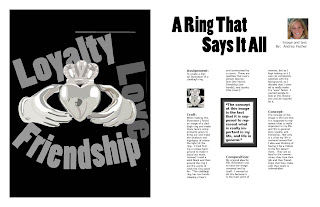
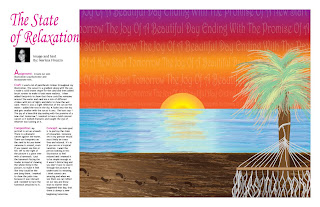
To create 8 more magazine spreads, bringing the running total to 10.
Craft:
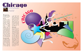
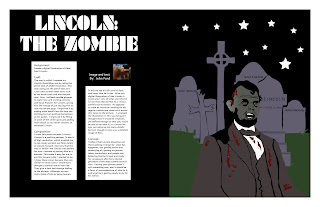
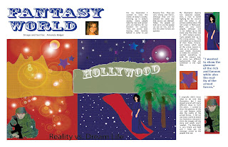
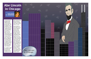
Process- I created the next 8 spreads by using the InDesign program and using different fonts and colors to correspond with the art work of the students in the class. I also went back and corrected the first two spreads that I created for last week by changing around some things that would not make sense in a magazine.
Technique- For this week I played around with colored text boxes and backgrounds that still allow the reader to easily read the text of the artists. I also added more pull quotes and title fonts that correlate to the artists' message of their work.
Composition:
I chose the colors that I did so that each spread would work well with eachother. The colors of the fonts or backgrounds were chosen to work with the colors in the illustrations. I arranged the contents mostly in columns to make it look like a typical magazine. I also chose pull quotes for some spreads that stood out to me while reading the corresponding text that the artist provided with their artwork.
Concept:
I wanted each spread to look like it was from a professional magazine, so I used several examples while working on each. The columns of the text are just like a professional magazine has, and I also played around with pull quotes, and different positions of both the text and images in order for it to look like a typical magazine.



No comments:
Post a Comment