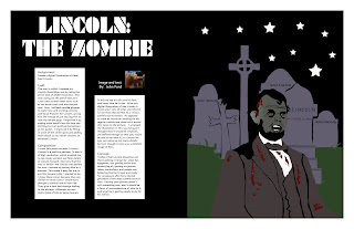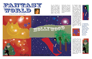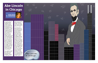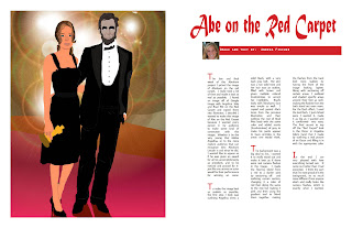
Saturday, March 28, 2009

Week 10


Assignment:
To create 10 more magazine spreads, bringing the running total to 20 spreads.

Craft:
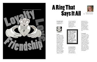
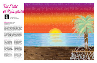
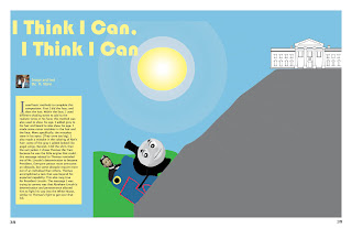
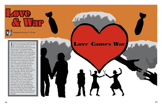
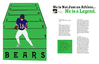
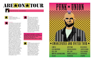
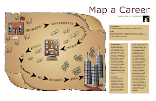
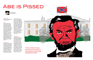
Process- I created the next 10 spreads by using the InDesign program and using different fonts and colors to correspond with the art work of the students in the class. I also went back to the previous spreads that I did and corrected some mistakes that were brought up during the critique, such as the breaking of the words in the block quotes, which I made sure not to do in the spreads for this week.
Technique- For these spreads, I also used several colors that corresponded with the image by using the eyedrop tool. This makes the connection between the image and the text more apparant. Not all of my articles include pull quotes, but the ones that do stand out in the article and also include colors that were in the color scheme of the artwork. I used font titles for the articles that are able to further the message of the work by giving the title some "oomph" to pull the reader into the article as well.

Composition:
The fonts and colors of each individual spread were chosen to work well together, and which were also selected based on the artist's original artwork as well. I arranged the contents mostly in columns, with the exception of a couple of spreads, to make it look like a typical magazine. I noticed that I will need to go back and make each bodytext the same font and size so that the magazine spreads share a common factor throughout, so that the magazine will look like one whole piece instead of 20 separate spreads.

Concept:
The concept for this week is the same as last week, which is to make the spreads all come together to look like a professional magazine. Each spread will eventually share similar characteristics, while exploring differences on each individual spread to make it unique and correspond with the artwork as well.


Wednesday, March 25, 2009

Week 9 (2)


This is my second illustration that now serves as a background for my turtle's tank!!

Tuesday, March 24, 2009

Week 9


Assignment:
To create 8 more magazine spreads, bringing the running total to 10.

Craft:
Process- I created the next 8 spreads by using the InDesign program and using different fonts and colors to correspond with the art work of the students in the class. I also went back and corrected the first two spreads that I created for last week by changing around some things that would not make sense in a magazine.
Technique- For this week I played around with colored text boxes and backgrounds that still allow the reader to easily read the text of the artists. I also added more pull quotes and title fonts that correlate to the artists' message of their work.

Composition:
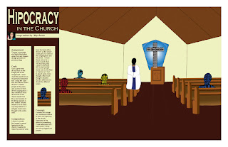
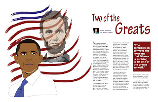
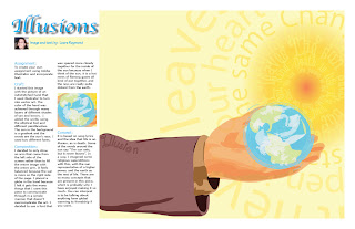
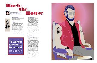
I chose the colors that I did so that each spread would work well with eachother. The colors of the fonts or backgrounds were chosen to work with the colors in the illustrations. I arranged the contents mostly in columns to make it look like a typical magazine. I also chose pull quotes for some spreads that stood out to me while reading the corresponding text that the artist provided with their artwork.

Concept:
I wanted each spread to look like it was from a professional magazine, so I used several examples while working on each. The columns of the text are just like a professional magazine has, and I also played around with pull quotes, and different positions of both the text and images in order for it to look like a typical magazine.

Monday, March 16, 2009

Week 8


Assignment:
To create the first two magazine spreads using the InDesign program.

Craft:

Process- I created each of the first two spread by first inserting the image into the two page spread to make the image the focus of the pages. Then, I inserted a title and by-line using the text tool. I also inserted the prepared text into the document using columns to look like a typical magazine spread. I used a small font size for the content, so that it would look like a typical magazine article.
Technique- I chose colors and fonts to correspond with the images that were previously inserted. The fonts of the titles were chosen to better represent the message of the images. The columns and section headings of the text are used for the reader to easily read the text.

Composition:

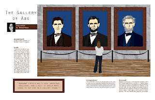
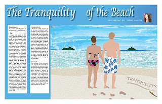
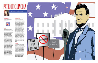
For the beach illustration I chose to use a blue background with white text to correspond with the blue sky and water of the illustration. This was a bold move to make in a magazine spread, because the blue and white combination can sometimes be difficult to read, but I felt that the color scheme went well with the illustration. I inserted the Lincoln illustration into the spread the way that I did because I wanted the image to overpower the text, so that the reader's eye would go directly to the image when they first flipped through this page. I also made sure that the fold did not chop off any important contents of the illustration. The colors of the Lincoln spread also served to portray the patriotic message of the image by using the colors of red and blue for the title and section headings.

Concept:

For both spreads I wanted the images to be the main focus of the spread, so that the reader would notice the image first, and then move on to read the text of the spread.