
Assignment:
To create the first two magazine spreads using the InDesign program.
Craft:
Process- I created each of the first two spread by first inserting the image into the two page spread to make the image the focus of the pages. Then, I inserted a title and by-line using the text tool. I also inserted the prepared text into the document using columns to look like a typical magazine spread. I used a small font size for the content, so that it would look like a typical magazine article.
Technique- I chose colors and fonts to correspond with the images that were previously inserted. The fonts of the titles were chosen to better represent the message of the images. The columns and section headings of the text are used for the reader to easily read the text.
Composition:
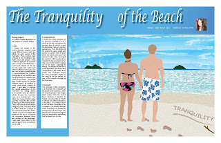
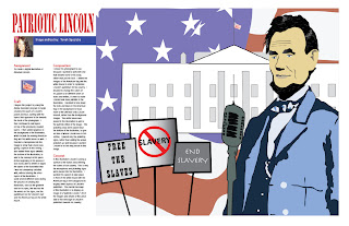
For the beach illustration I chose to use a blue background with white text to correspond with the blue sky and water of the illustration. This was a bold move to make in a magazine spread, because the blue and white combination can sometimes be difficult to read, but I felt that the color scheme went well with the illustration. I inserted the Lincoln illustration into the spread the way that I did because I wanted the image to overpower the text, so that the reader's eye would go directly to the image when they first flipped through this page. I also made sure that the fold did not chop off any important contents of the illustration. The colors of the Lincoln spread also served to portray the patriotic message of the image by using the colors of red and blue for the title and section headings.
Concept:
For both spreads I wanted the images to be the main focus of the spread, so that the reader would notice the image first, and then move on to read the text of the spread.


No comments:
Post a Comment