Thursday, February 26, 2009

Week 7


Assignment:
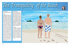
Digital illustration of two people on a beach setting.

Craft:
Process- I created this project in the Adobe Illustrator program using many different layers, tools and effects for each section of the illustration. There are four main sections of this illustration: sky, water, sand, and people. I used a different approach to complete each section of the illustration. I used brush strokes on the sky and the water, and I also used different effects on the water and the sand as well in order to give it a more realistic feel. The people were created mostly with different layers, in addition to using some brush strokes as well.
Technique- I was able to improve this draft of the illustration by adding different effects to the water to make it look like the sun was glistening off of the ocean. I also changed the sky from a simple gradient to several brush strokes to make it look like a mixture of sky and clouds above the water. I added a solid line between the water and the sky to distinguish the separation between these two sections of the illustration.

Composition:
I chose this photo because of its personal meaning to me. I chose to use the colors that I did because they all served to give this illustration more of a realistic appearance. From the bottom of the picture the sand is light and moves to a darker color to show where the waves come up on the sand and make it wet. I arranged the contents in this way because I wanted the two people to be the only ones in the scene looking out at the water, admiring it's beauty. The people are the focus of this illustration, and that is why I placed them in the middle of the image. I created two variations of this draft of the illustration because I was not sure how to effectively display the message of the "tranquility" of the beach. One version of the illustration shows the word written in the sand by the two people in the illustration, and the other version shows the word written in the clouds that the two people are looking out at.

Concept:
The overall message of this illustration is to show how tranquil the beach is. The two people are the focus of this illustration because the viewer is seeing how peaceful this scene is to the two people in the illustration. This is why there are not any other people on the beach, and that is why I chose to use the word tranquility in this illustration.


----------------------------------------------------------------------------------------------------------


LINCOLN ILLUSTRATION SUMMARY
Assignment:
To create a digital illustration of Abraham Lincoln.
Craft:
Process- I began this project by using the Adobe Illustrator program to begin creating the layers of Lincoln's jacket and face, starting with the layers that appeared to be towards the back of the photograph. I then continued to add layers on top of the previously created layers. I then added graphics to the background of the illustration, which include the waving American flag and the white house as well. I inserted a microphone into the image to show that Lincoln was giving a speech in this setting. I also added three signs towards the bottom of the illustration, to add to the concept of this piece.
Technique- At the beginning of this process I was easily able to delete or adjust the layers of the illustration that i was not completely satisfied with, without altering the other layers of the illustration. I used several different tools during the process of creating this illustration, such as the gradient tool for his eyes, the text tool for the words on the signs, and the paintbrush tool for Lincoln's hair and the American flag on the white house.
Composition:
I chose this photograph to use because I wanted to work with one that showed some of his body, rather than just his face. I added the images of the American flag and the white house in order to symbolize Lincoln's patriotism for his country. I decided to change the colors of his jacket to be different tones of blues and whites, in order to make Lincoln look more patriotic in the illustration. I decided to tone down the reds and blues in the American flag in the background to focus more of the attention onto Lincoln himself, rather than the background images. The white house was placed in the illustration to add to the patriotic effect of the image. The picketing sings were placed near the bottom of the illustration, to give an idea of where Lincoln was in this setting. I placed only the picketing signs, rather than adding the actual picketers as well because I wanted Lincoln to be the only person in this image.
Concept:
In this illustration Lincoln is giving a speech to the nation about freeing the slaves of our country. This is why the microphone and picketing signs were placed into the illustration. I wanted this speech to take place in front of the white house with the American flag in the background to display other aspects of Lincoln's patriotism. The overall message of this illustration is to display an image of a "patriotic Lincoln." All of the images and details of this piece add to this message of Lincoln's patriotism towards his country.

Monday, February 23, 2009

Week 6

Assignment:
Second illustration of the course. Choose something that makes you happy/sad and create an illustration based off of that idea.

Craft:
Process- I took a photograph of my boyfriend and I at the beach and created an illustration of our bodies using several layers. Then, I found a picture of a beach scene on the internet that caught my attention and created the illustration of the beach background, which is the setting of the illustration.
Technique- I improved the overall appearance of this illustration by adding details to the photo such as different effects to give the illustration a more realistic feel. Also, there are many details on the two people in the illustration as well, such as their hair, skin, and clothing. I think that the grain effect on the sand gives it a very realistic feel, which was exactly what I was looking for.

Composition:
I chose this photograph because it is a picture of myself from something that I have experienced in my life. I chose the background that I did because going to the beach is my favorite thing to do. I wait all year for the first day that it's warm enough to go to the beach! There is something so calming and peaceful about the beach, and that is why I chose to only incorporate two people into the illustration. I wanted them to be the only two people on that beach to play up the word usage of tranquility that I chose to use here. I incorporated the word tranquility into the photo by making it seem like one of the two people wrote the word in the sand with the stick that was near the word.

Concept:
The message that I was going for in this piece was to translate the tranquility of the beach to the audience. There are only two people in this illustration to display how peaceful it can be. There are no distractions in this illustration because I wanted the focus of the piece to be the two people enjoying the day and appreciating everythign that the beach has to offer.

Tuesday, February 17, 2009

Week 5


Idea for project #2

My favorite thing to do during the year is to go to the beach. I wait all year long for that first day that it's warm enough to make the drive to Indiana to spend the day at the dunes. So, this is the setting that I would like to use for the second project that we have to create. I have a picture that was taken two summers ago of my boyfriend and I standing in the sand at the beach looking out onto the water (pictured to the right). My idea is to use this image along with the beach setting that I talked about above with also adding a sunset into the background to create my next illustration. I would incorporate text into this illustration by creating text along the border of the sunset using words that go along with the beach scene.


Monday, February 9, 2009

Week 4


Assignment:
Digital Illustration of Abraham Lincoln including background graphics.

Craft:
Process- I used the "Patriotic Lincoln" version of my illustration to move on to this draft of the project. I used a wavy American flag for the background of the illustration to play up the patriotic aspect of the illustration. I also added the white house to the background of this illustration and added a microphone close to Abe and three picketing signs protesting slavery as well.
Technique- I enhanced some of the details of Lincoln, including the colors on his face and adding more detail to his hair. I also changed up his eyes in order to make them pop from the color usage of his jacket. The added details of the white house, microphone, and signs add a lot to this illustration because people will now be able to percieve a story from the illustration rather than just Abe's body that was in my first few drafts.

Composition:
Since I chose to move on with my "Patriotic Lincoln" illustration I needed to add images that symbolized his patriotism for his country. I chose to use watered down colors of reds and blues for the flag in the background in order for Lincoln to still stand out from the background of the flag. I placed the picketing signs down below because I wanted to display the message that the people were trying to send without showing them because I wanted Lincoln to be the only person in the illustration. I included the white house in the illustration because that one of the icons of the president and also an icon of Lincoln's patriotism.

Concept:
I wanted the illustration to display the message that Lincoln was giving a speech to his country about ending slavery. I wanted this speech to take place in front of the white house with the American flag in the background to display another aspect of patriotism. Even though microphones were not invented until after Lincoln's time and there was probably not a lot of picketing that went on around that time, I wanted to give this illustration more of a modern feel while displaying the message of "Patriotic Lincoln."


Tuesday, February 3, 2009

Week 3


Assignment:  
Digital illustration of three variations of Abraham Lincoln.

Craft:
Process- I started this week's project by taking the first draft that I constructed from last week and changed it up in three different ways to produce three variations of my first draft.
Technique- I changed the colors and details of the photos along with the backgrounds and adding new techniques such as the gradient tool as well. Each variation of the illustration has different details of Lincoln's face and different details of his jacket and background as well.

Composition:
**Note that the illustrations to the right are in the opposite order of the descriptions below**
#1- For the first variation of Lincoln, I had the vision of making him "Patriotic Lincoln." I changed the colors of his jacket to different shades of blue and his undershirt to a bright white as well. I also changed the color of his eyes to a blue tone to make them stand out. I used a gradient background of red and white to incorporate those colors of the flag into the illustration.
#2- In the second variation of Lincoln, I wanted it to be "Distressed Lincoln." I had the vision of making him look like it was his last day of office, and I wanted to show the exhaustion on his face and how much of a toll the presidency took on him. His face is very pale and there are a lot of wrinkles and other details on his face to make him look aged.
#3- For the third variation of Lincoln, I wanted him to look like "Classic Lincoln." The circular gradient background gives it the look of a photograph and that went very well with my theme for the illustration. I also changed the strokes of his hair and the details of his face to go along with the picture as well. I also changed the shape of his eyes to give them more of a classic look as well.

Concept:
For next week I have chose to go further with the "Patriotic Lincoln" variation. For this photo I plan to incorporate the flag and the whitehouse some how and to maybe have him be making an inspirational speech to his country.