Wednesday, April 29, 2009
Week 14 (2)
New Website - Click Here.
This website contains a welcome page, an about the editor page, and an albums page that links to all of the spreads in the magazine. There are also external links on the pages that link to this blog and the site that people can purchase a copy of the magazine as well. The welcome page gives a description of the magazine, along with a picture of the cover, and two featured spreads of the magazine as well. The about the editor page has a picture of me with a description of my contrabution to the magazine, as well as other information about me as well. The albums page serves as a link to the page with all of the spreads of the magazine. Viewers can also view a slide show of the spreads from this page as well, by clicking the slideshow button.
Monday, April 27, 2009
Week 14
This week we continued to work on our web sites using the IWEB program. We were supposed to try to get away from the format of the website that we were given, to make it mor of our own. I created a banner using a gradient of the colors of pink and yellow to correspond with my magazine, and this banner is present throughout the four pages of the site to give it some uniformity. I randomly placed stars on the pages because of the magazine's title of Star Weekly. I also changed the borders on the pictures that I inserted, and changed the textboxes as well. I also made the album on my albums page to look like a flip scrap book. I tried to have the color scheme of the site remain with pinks and yellows because those are the colors of my magazine's cover. I also sent out my second draft of the magazine last week, so I am still waiting for my final draft to arrive.
Monday, April 20, 2009
Week 13
This week we had a critique on our first draft of our returned magazine. We worked with partners to critique people's magazines and wrote down a list of suggestions that could help with their final draft of their magazine. This week we are supposed to continue fixing the errors of our first drafts of the magazines so that we are ready to send out our final draft next week. In my first draft, some of the things that I needed to fix were the titles of my spreads because some of the fonts were either changed in the process or the drop shaddows did not turn out the way that I wanted them to. Also, in a couple of my spreads the text was cut off by the middle fold of the magazine, so I had to move the image so that the text would be legible. Also, on one of my spreads I had duplicate page numbers because I forgot to delete the first page number after I applied the page numbers of the master spread. I changed the fonts on the cover, so that it looks more like a typical magazine cover with various fonts and sizes of the titles. For the table of contents page and the credits pages I switched the backgrounds to be pink and the letters to be yellow, so that it would correspond with the cover. So far those are the only changes that I have made to my first draft of the magazine. I also plan on going through the text of each spread to make sure that there are no typing errors in the text.
Wednesday, April 15, 2009
Week 12
During this week of class, we continued to work on our covers and table of contents pages on Monday. My first draft of the magazine was also delivered on Monday, so that gave me more time to look through my spreads to see any mistakes or anything that I needed to change for my second draft of the magazine project. This week on Wednesday, we also continued working with the IWEB program to add a slideshow to the other two pages that we created last week. We learned how to create hyperlinks, as well as use the IPHOTO program to insert the JPEG spreads into the IWEB program to create the slideshow/myalbums page. Since I was on a different computer than I originally started on, I had to redo my first two pages (the welcome page, and the about me page) before I was able to move on to create the My Albums page.
Thursday, April 2, 2009
Week 11
Assignment:
This week we had to finalize our magazine spreads and create a table of contents and a credit page for the authors.
Craft:
Process- I created these pages of the magazine by using the same approach that I used to create the previous spreads of the magazine. For these three components I chose to have all three look similar, using the same colors and fonts, to add another component of the magazine that is uniform.
Technique- I improved the spreads by going back to each one and making the font style and font size consistent throughout all of the spreads. I also made some last minute changes to the spreads as well, such as adding the page numbers and completing the last two spreads that were missing from the magazine.
Composition:
For the cover of the magazine I took out the people from my illustration of the beach and used it as the cover image, along with a banner of stars to go along with the magazine's title, Star Weekly. I also took some of the article titles and formed them into headlines for the cover as well. For the table of contents and the credits page I incorporated the stars from the cover into the pages and used the same text through the two pages to make them look similar as well. The two inside pages that I created use the same two text sizes, fonts, and images from the cover on both pages. This helps to bring the magazine together as a whole.
Concept:
The plan for this project from the begining was to make this magazine look like a typical, professional magazine. I feel that I have accomplished this goal by putting everything together this week and adding the last components of the magazine to make it all come together. I now have a finalized version of my magazine project, that looks even better than what I had imagined prior to starting the project.
Also, this week we began creating our web portfolio by first exporting all of our magazine spreads to jpg images. Then we used the iweb program to begin creating a welcome page and an about the author page before we create a slideshow of our spreads for next week's class.
Saturday, March 28, 2009
Week 10
Assignment:
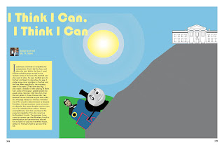
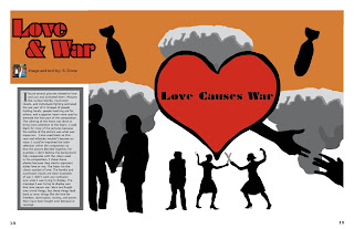
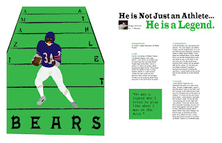
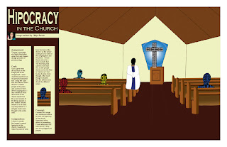
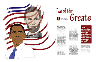
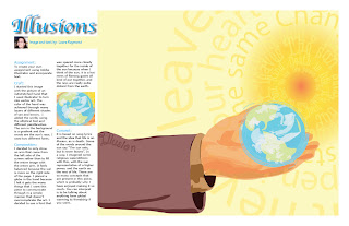
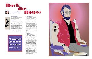
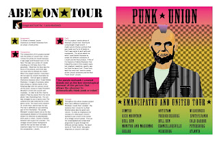
To create 10 more magazine spreads, bringing the running total to 20 spreads.
Craft:
Process- I created the next 10 spreads by using the InDesign program and using different fonts and colors to correspond with the art work of the students in the class. I also went back to the previous spreads that I did and corrected some mistakes that were brought up during the critique, such as the breaking of the words in the block quotes, which I made sure not to do in the spreads for this week.
Technique- For these spreads, I also used several colors that corresponded with the image by using the eyedrop tool. This makes the connection between the image and the text more apparant. Not all of my articles include pull quotes, but the ones that do stand out in the article and also include colors that were in the color scheme of the artwork. I used font titles for the articles that are able to further the message of the work by giving the title some "oomph" to pull the reader into the article as well.
Composition:
The fonts and colors of each individual spread were chosen to work well together, and which were also selected based on the artist's original artwork as well. I arranged the contents mostly in columns, with the exception of a couple of spreads, to make it look like a typical magazine. I noticed that I will need to go back and make each bodytext the same font and size so that the magazine spreads share a common factor throughout, so that the magazine will look like one whole piece instead of 20 separate spreads.
Concept:
The concept for this week is the same as last week, which is to make the spreads all come together to look like a professional magazine. Each spread will eventually share similar characteristics, while exploring differences on each individual spread to make it unique and correspond with the artwork as well.
Wednesday, March 25, 2009
Subscribe to:
Posts (Atom)